When Walter Gropius founded the Bauhaus school in Weimar in 1919, he probably didn't anticipate that his ideas about form and function would still be shaping corporate identities more than a century later. Yet here we are. Open any branding portfolio from the past decade and the fingerprints of that German design school are everywhere—clean geometry, sans-serif typography, primary colour palettes, and a relentless commitment to clarity.
Form Follows Function, Still
The Bauhaus mantra that design should serve purpose first and decoration second has become the default philosophy of modern brand identity. Companies like Apple, Google, and Airbnb have built visual systems rooted in this principle. Their logos are stripped-back. Their colour palettes are deliberate. Their typography choices prioritise legibility over flair.
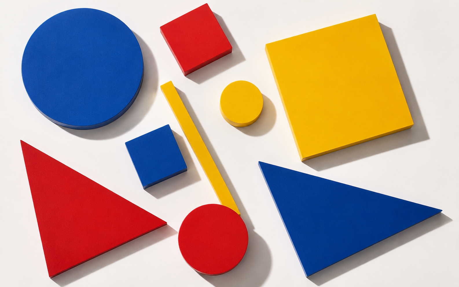
This isn't coincidence. The Bauhaus teachers—Kandinsky, Klee, Moholy-Nagy—developed a visual grammar based on geometric primitives: circles, squares, triangles. They believed these shapes communicated universally, transcending language and cultural barriers. That idea proved remarkably useful for global brands needing to speak to audiences in 190 countries simultaneously.
Typography as Identity
Perhaps nowhere is the Bauhaus influence more visible than in typography. Herbert Bayer's universal typeface, designed at the school in 1925, was one of the first sans-serif faces created specifically for clarity and mass communication. It looks strikingly similar to typefaces tech companies commission today.
The recent wave of brands switching to custom geometric sans-serifs—Burberry, Warner Bros, Spotify—follows a path the Bauhaus carved out nearly 100 years ago. The logic hasn't changed: a clean, geometric letterform feels modern, approachable, and scalable across media from billboards to app icons.
Grid Systems and Visual Order
Bauhaus designers were among the first to formalise grid-based layout systems. Josef Albers and his students created compositions using strict mathematical relationships between elements—margins, gutters, and columns that gave complex information a sense of visual order.
Modern brand guidelines read like Bauhaus textbooks. Spacing rules, minimum clear zones around logos, fixed aspect ratios for imagery—all of these descended from the same impulse to bring system and logic to visual communication. A 2024 survey of Fortune 500 brand guidelines found that 87% specify grid-based layout rules, a practice that traces directly to Bauhaus principles.
The Limits of the Legacy
There's a growing critique that the Bauhaus influence has become too dominant. When every brand adopts the same geometric sans-serif and the same minimal colour palette, differentiation suffers. Some designers argue that the next chapter in branding will need to break from Bauhaus orthodoxy rather than refine it further.
That critique has merit. But it also misreads the Bauhaus mission slightly. Gropius never advocated for uniformity—he advocated for intentionality. The school's real legacy isn't a specific aesthetic; it's a process. Start with the problem. Remove what doesn't serve it. Let the solution emerge from constraints. That process remains as relevant in 2026 as it was in 1919, regardless of whether the result looks like a Bauhaus poster or not.